77 Flavors

2026 Q1

77 Flavors

Fun, nostalgic brand for a history & culture nonprofit + podcast
See it in the wild

“If you’re looking for designers who will understand your vision, deliver on everything, and provide such a comfortable experience—don’t look any further!!

— Sara Faddah,
Founder of 77 Flavors

Mockup of the 77 Flavors home page displayed in the Safari browser on a MacBook that sits on an orange velvet sofa.
Before: The DIY logo and Wix website left plenty of room for improvement!
After: A screenshot of the completed 77 Flavors home page uses a fully realized brand identity and offers a lot more room for the organization to grow.
Before: The podcast cover image was consistent with the website.
After: A mockup of the new podcast cover image in Apple Podcasts on an iPhone. The episode title is "Chicago is a Her (and She's 189)", and the cover image shows Dario and Sara smiling at a bar. The stacked variation of the logo appears above "with Sara & Dario" in the brand's script font.
Clients' moodboard shows two covers from The Chicagoan magazine, a closeup photo of a red brick wall, a muted red Pantone swatch called "Fired Brick", and posters for both Chicago-style hot dogs and a 1930s-inspired antique show.

Vintage Vibes

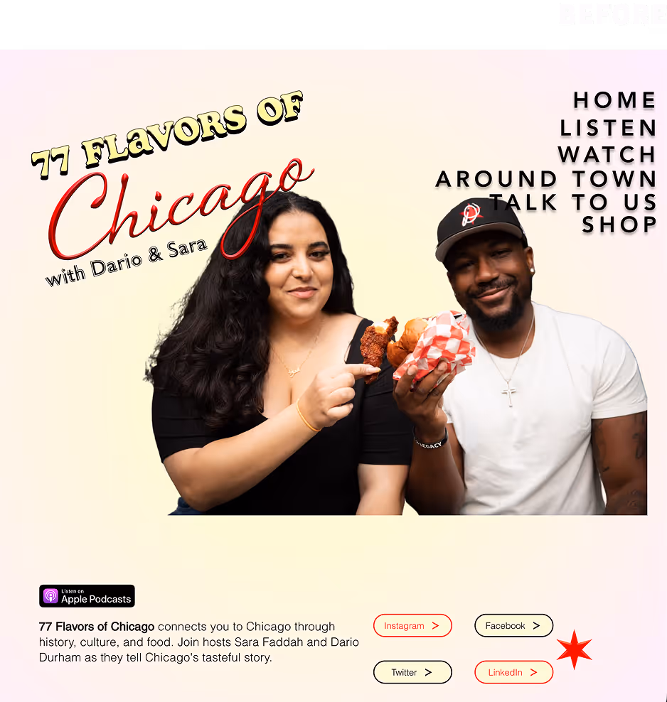
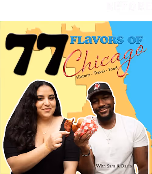
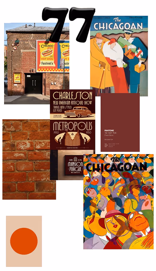
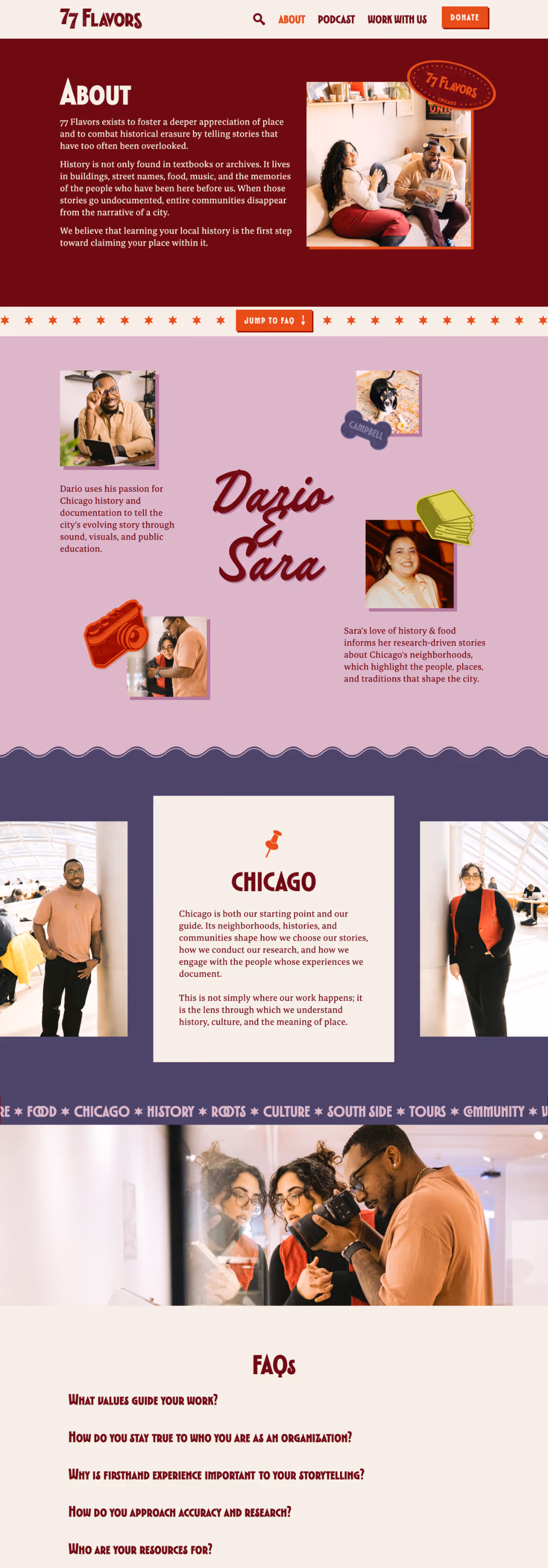
Sara & Dario needed a brand that would be “fun but also taken seriously” and would celebrate Chicago’s history and culture while being flexible enough to apply to other cities in the future.

In reviewing the moodboard they provided along with answers to our strategy questionnaire, we noticed:

  • A brick red/maroon color and texture
  • Slightly muted primary colors
  • Colorful illustrations with simplified/geometric shapes
  • Vintage (early to mid 20th century) graphic influences
  • Geometric typefaces with varied or noticeably low crossbars/waists

They were especially drawn to two specific covers from The Chicagoan magazine, and these ultimately inspired the two potential design directions that Cass & I considered for this project.

Moodboard 1: Vibrant Deco

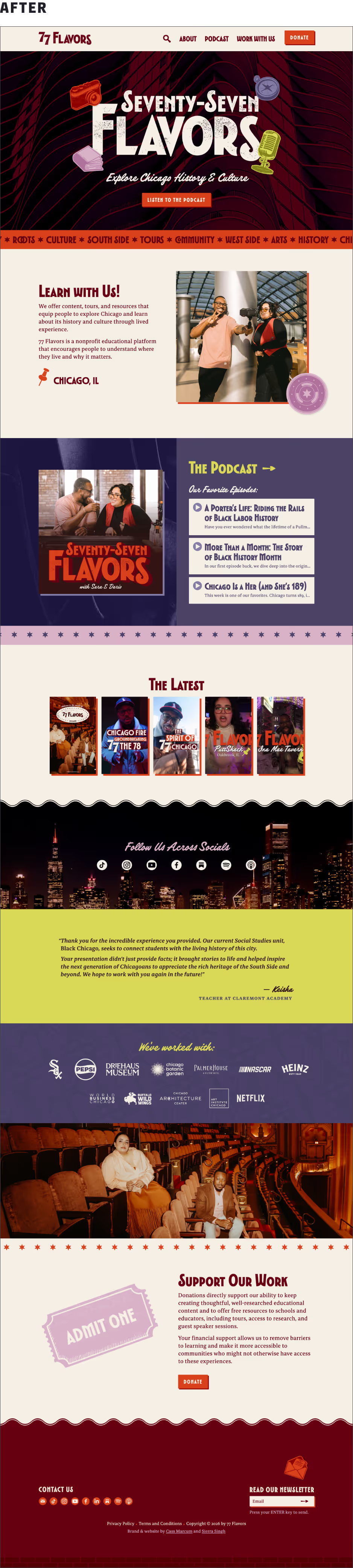
This design uses Art Decoi-inspired type, fine-lined illustrations, and contrasting warm colors to achieve a vintage maximalist aesthetic.

  • A geometric sans serif typeface inspired by 1930s poster lettering paired with an unpretentious serif feels both educated and outgoing.
  • These colors are high contrast and warm to create an inviting vibe that reflects Chicago’s cultural diversity and friendly people.
  • The illustration style features fine parallel lines that evoke historical engravings.
Mood Board 1. A bold Art Deco sans serif font paired with a casual serif. Geometric patterns & textures inspired by Chicago’s Art Deco architecture. Engraving-inspired illustration style feels vintage & bookish.

Moodboard 2: Jazzy Nostalgia

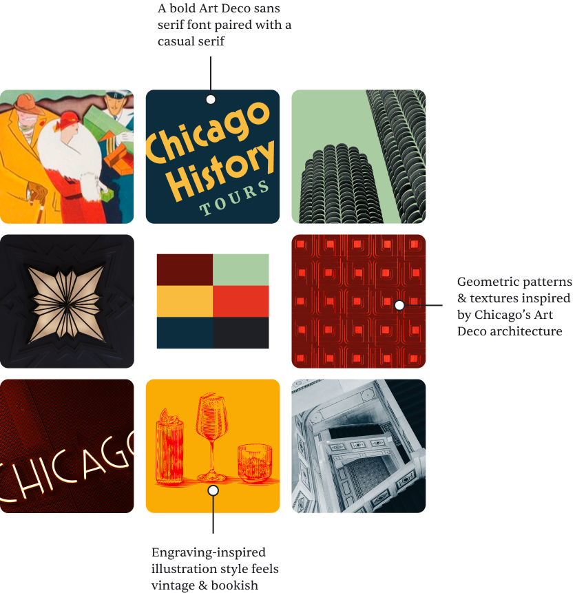
This design leans into fonts that blend old & new, eclectic illustrations, and distinctive colors to communicate the brand’s adventurous vibe.

  • A nostalgic and inviting slab serif paired with a quietly quirky, friendly sans serif makes for a fun and accessible combination.
  • These colors are warm, slightly muted, and unusual to help make the brand feel exciting and culturally rich.
  • This vintage-inspired illustration style uses chunky, loosely drawn, and rounded lines for a handmade, artistic aesthetic.
Mood Board 2. Nostalgic slab serif paired with a friendly sans-serif font. Customized logo for a retro vibe that also feels fresh. Art Deco patterns with bold lines subtly tie in Chicago’s history.

“Y’all are cookin’!

— Dario Durham,
Founder of 77 Flavors

Mix & Match?

The Jazzy Nostalgia moodboard won approval because its unique color palette and imagery resonated with Dario and Sara, but the Vibrant Deco direction was a close second because of its typography.

Cass and I took this feedback into account as we designed the brand identity; because the vibe is eclectic, a mix-and-match strategy worked beautifully in this case!

Crafting the Logo Suite

This wordmark was deceptively challenging to design! Even when we’d finally found an ideal primary typeface for this brand (TT Modernoir), it took many iterations before we struck gold.

The final logo is carefully calibrated to guide the eye smoothly while incorporating visually interesting details that add vibrant personality without overwhelming the whole.

Unused iterations of the primary logo design. All use TT Modernoir as a starting point, but they feature a variety of customized details.
Primary logo. Sheared terminals (77, F, L) use negative space to create an Art Deco-inspired motif of parallel and diagonal lines. Sheared terminals (77, F, L) use negative space to create an Art Deco-inspired motif of parallel and diagonal lines. Alternate condensed O glyph feels balanced and harmonizes with the surrounding letterforms. Hanging curly S is proportional opposite the 77 and fits pleasingly next to the customized R terminal.

Primary Logo

This horizontal wordmark layout is simple but effective, which is ideal for a primary logo. The small caps treatment works well because it’s both legible and visually interesting.

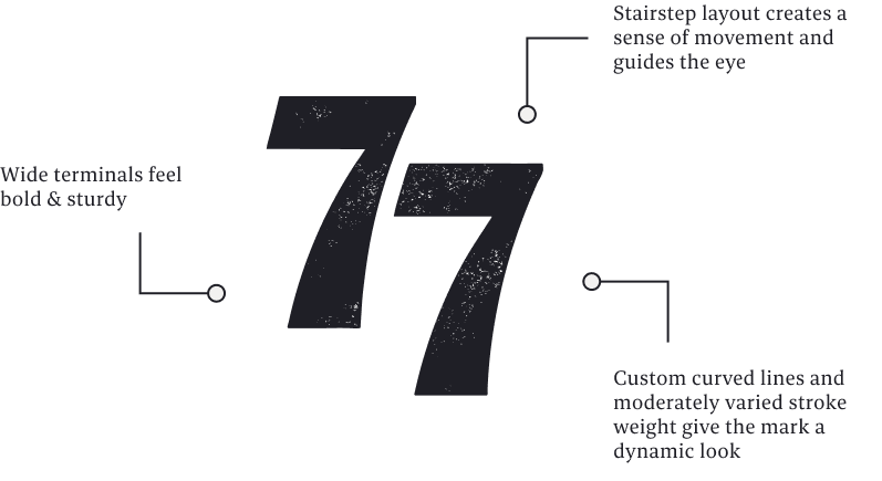
Customized chunky, staggered 7s that use a varied stroke width and align with the letter cap heights draw the eye so that the number is read first. The unique curled R and S terminals create a sense of movement, fun, and excitement that’s perfect for such an adventurous brand.

Stacked Logo

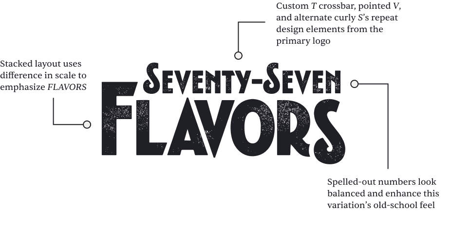
This variation uses a stacked layout and spelled out numbers to offer a more vertical version of the logo that’s better suited to spaces where the available height is more spacious than the width.

The typography here uses the same details found in the primary logo, but the stacked logo has a more antique feel that’s especially appropriate for slightly more formal settings.

The stacked logo variation. Stacked layout uses difference in scale to emphasize FLAVORS. Custom T crossbar, pointed V, and alternate curly S’s repeat design elements from the primary logo. Spelled-out numbers look balanced and enhance this variation’s old-school feel.
The framed logo variation. The letterpress texture is distinctive and feels connected to history. Dotted border adds a layer of vintage pattern and personality. Oval frame shape evokes smashed penny souvenirs.

Framed Logo

This oval variation of the logo was inspired by pressed coins, which were first seen in America at the 1893 Chicago World’s Columbian Exposition.

“Chicago” uses the primary brand font’s alternate narrow C, G, and O glyphs as a subtle nod to the Chicagoan magazine wordmark. The dotted border is often seen on elongated penny designs, and it allows space to specify Chicago or any other city 
as the brand grows.

Minimark Logo

This mini mark maintains consistency with the primary logo while serving as a standalone representation of the brand.

The figures have distinctively customized curves yet remain legible at small sizes due to their moderate stroke–weight contrast. A subtle letterpress texture lends informal historical character to the mini mark as well as to the other three versions of the logo.

Minimark logo variation. Wide terminals feel bold & sturdy. Stairstep layout creates a sense of movement and guides the eye. Custom curved lines and moderately varied stroke weight give the mark a dynamic look.
Mockup of brand fonts in use on a web page. Buttons, nav links, and "The Chicagoan MAgazine" are in TT Modernoir. "Season 3, Episode 123" is in Filmotype Keynote. The episode description is in Bespoke Serif.

Distinctive Typography

  • TT Modernoir Bold is a jazz-inspired display sans that expresses the brand’s fun & adventurous character.
  • Filmotype Keynote is a vintage script that shows the brand’s warmth, relatability, and humanity.
  • Bespoke Serif is a contemporary typeface designed for reading. It gets messages across quickly and has oldstyle numerals.

A Maximalist Palette

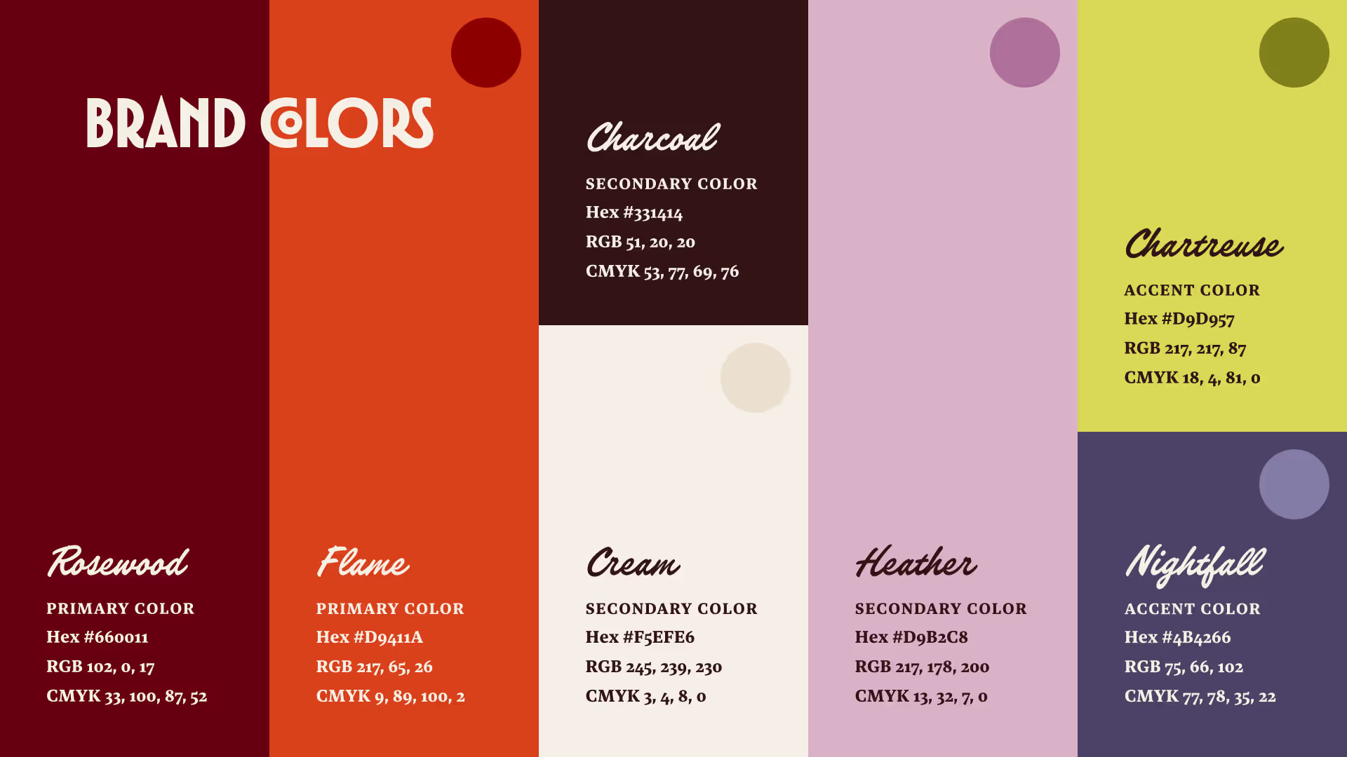
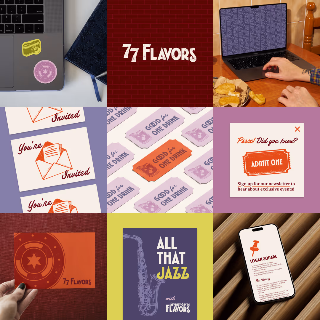
Cass and I chose an unusually expansive palette to reflect the many facets of this brand.

Primary Colors

  • Rosewood, a rich burgundy inspired by the bricks that are often found in Chicago’s architecture.

  • Flame, a vibrant & exciting red-orange that represents the brand’s adventurous side, plus Alt Flame for tonal brand illustrations and patterns.

Secondary Colors

  • Charcoal, a deep, warm neutral that feels grounded and adds functional contrast.

  • Cream, a bright, warm neutral that’s familiar and relatable as well as inviting, plus Double Cream for lower-contrast applications (such as on the website).

  • Heather, a soft vintage hue that’s unexpected and underscores the brand’s nostalgic vibe, plus Alt Heather for tone-on-tone brand assets.

Accent Colors

  • Chartreuse, a fun yellow-green that gives the brand a retro-inspired feel and piques curiosity, plus Alt Chartreuse for tonal brand assets.

  • Nightfall, a collegiate blue-purple that expresses the brand’s thoughtful character, plus Alt Nightfall for low-contrast brand assets.

Brand colors as described above and displayed in the Brand Guidelines, including Hex, RGB, and CMYK color codes.

Illustrations

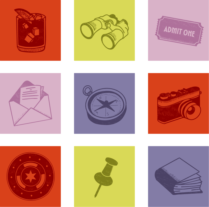
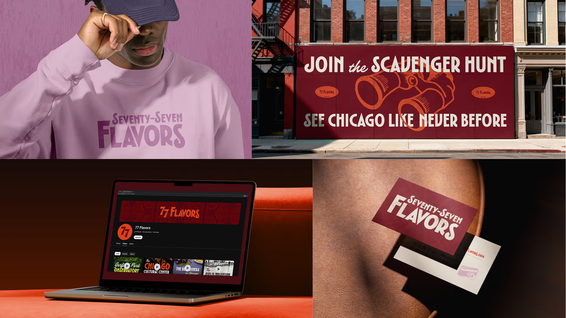
The hand-drawn brand illustrations were inspired by antique engravings like those found in old books.

The same letterpress texture used in the logo suite makes them look imperfectly inked for a casual yet historical vibe, while their subjects suggest adventure & curiosity.

The token asset (lower left corner) was inspired by an antique metal CTA token and features a Chicago star as a tribute to 77 Flavors’ home city.

These nine brand illustrations are textured, and each uses a combination of filled and outlined shapes as well as engraving-inspired parallel hatch markings. 1) a rocks glass with a cocktail on ice and a citrus slice garnish 2) binoculars 3) a paper ticket reads "ADMIT ONE" 4) an open envelope reveals a letter 5) an antique compass 6) a vintage camera 7) a public transit token with a six-pointed star at the center 8) a pushpin 9) a book.

Patterns

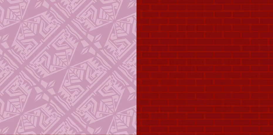
The ornate Art Deco-inspired brand pattern amplifies the decorative geometry of the primary brand font and logo suite, while the textured brick pattern feels more casual.

Having two patterns offers opportunities for pattern mixing, which adds maximalist depth to the brand’s aesthetic.

Brand pattern swatches. The first is an Art Deco-inspired geometric pattern in tonal shades of mauvey heather. The second is a red-on-red textured brick pattern.

Brand Assets in Use

Brand assets in use on stickers, invitations, a web popup, drink tickets, a responsive web page, and as a patterned desktop background.
Mockups show a man wearing a 77 Flavors sweatshirt, a street-level billboard that reads "Join the Scavenger Hunt: See Chicago Like Never Before," the 77 Flavors YouTube page, and business cards on a leather sofa.Mockups show a vinyl record with a label reading "77 Flavors Live," a banner that reads "Explore Chicago with Us," a branded "Triple Chocolate Crunch" ice cream container, and the 77 Flavors home page on a laptop.
A screenshot of the Podcast page features the 77 Flavors Podcast Cover, a decorative retro microphone sticker, and a list of episodes.

Web Design

A screenshot of the Search page shows results for the search term "Chicago".

Designing the Search Experience

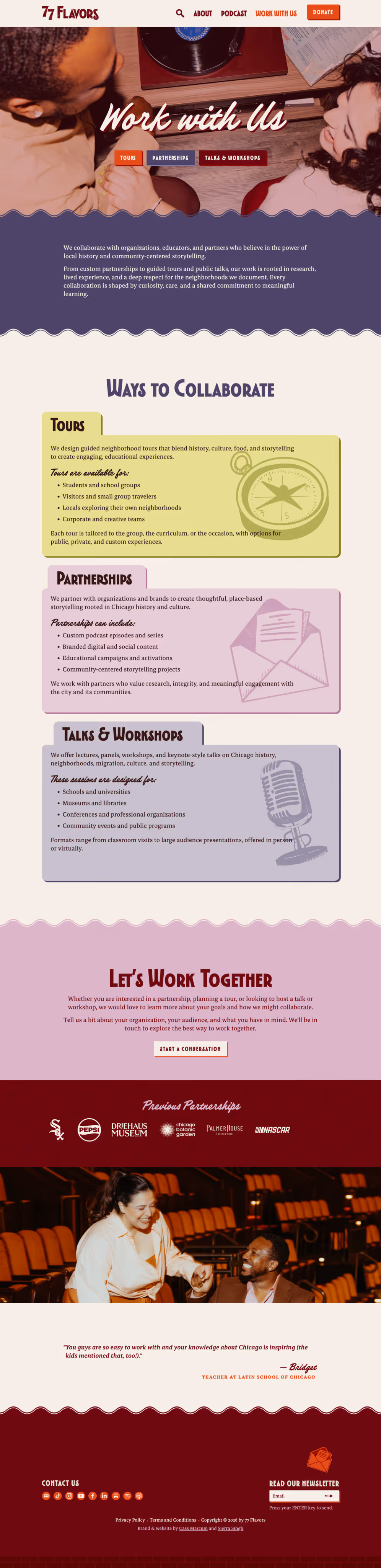
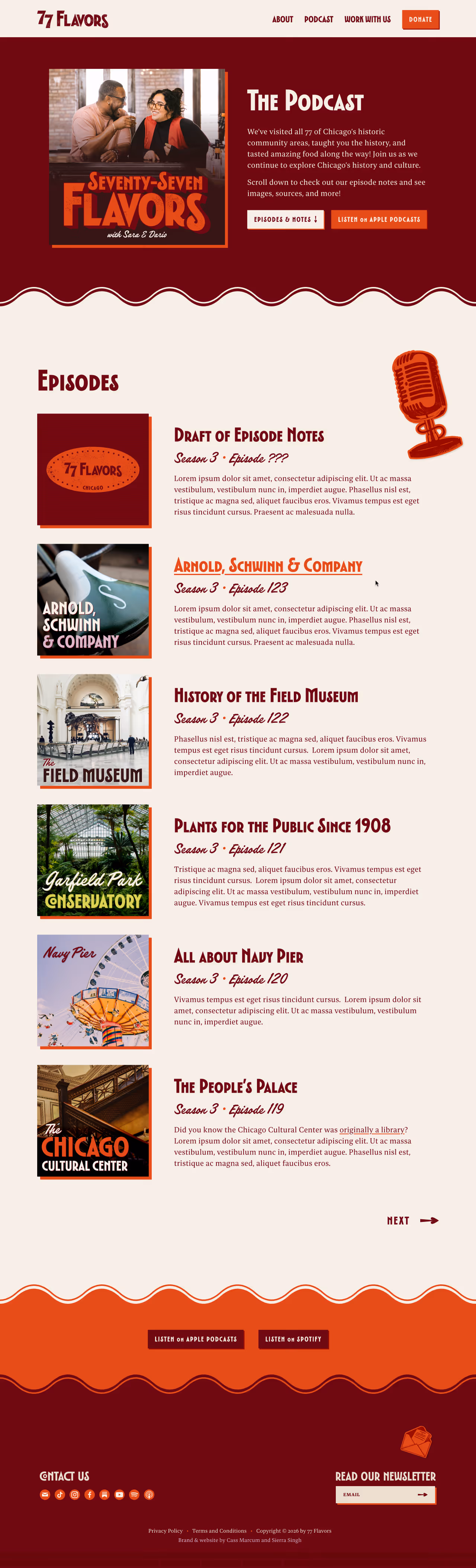
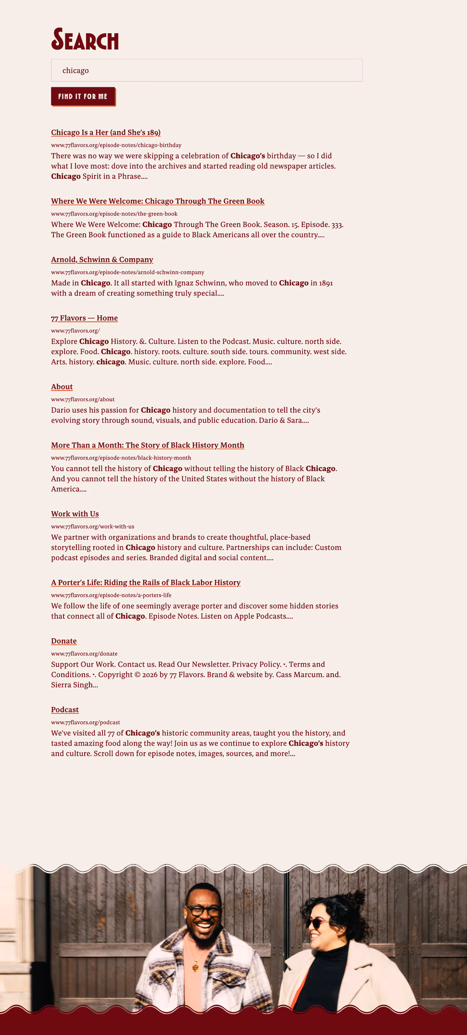
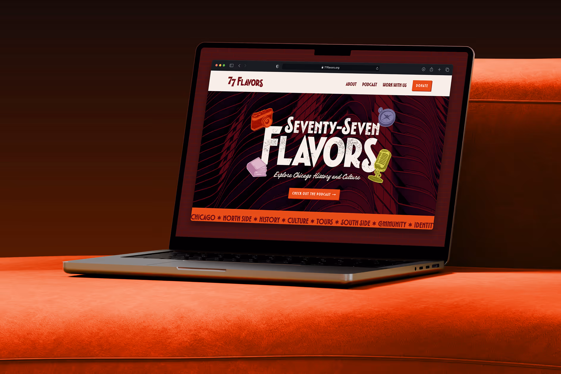
The Webflow CMS offers a built-in sitewide search capability, so we decided to implement it even though it wasn’t among our clients’ top priorities.

I designed a custom magnifying glass icon so the search link both  wouldn’t take up too much space in the nav and would match the brand aesthetic.

By default, the Webflow site search shows a “No results” message before a search has been performed. This isn’t ideal from a UX standpoint, so I added some custom code to the page that hides this message until a search fails and then displays “No results found; please check your search query for spelling mistakes!”

Webflow Build

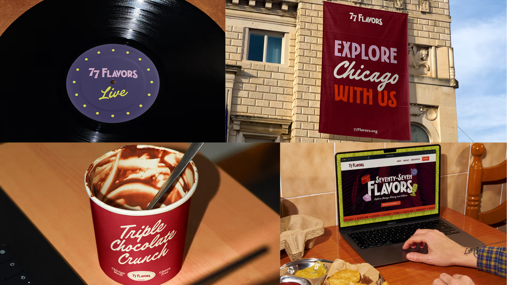
Because Cass and I needed a flexible development tool and 77 Flavors needed robust CMS capabilities for their podcast episode notes, we opted to build the site in Webflow.

Fluid Type & Spacing Variables

To ensure that our build would be as robust and responsive as possible, I used the Utopia Fluid Type Scale Calculator and Fluid Space Calculator to set up type scale variables (-1 through 7) and spacing variables (3XS through 3XL) in Webflow.

This required some extra work up front, but it was worthwhile because using these variables thoughout the site really streamlined the process of ensuring it’s fully responsive!

/* @link https://utopia.fyi/space/calculator?c=320,18,1.25,1240,20,1.414,6,1,&s=0.75|0.5|0.25,1.5|2|3|4|6,s-l|l-2xl|xl-3xl&g=s,l,xl,12 */

:root {
  --space-3xs: clamp(0.3125rem, 0.3125rem + 0vw, 0.3125rem);
  --space-2xs: clamp(0.5625rem, 0.5408rem + 0.1087vw, 0.625rem);
  --space-xs: clamp(0.875rem, 0.8533rem + 0.1087vw, 0.9375rem);
  --space-s: clamp(1.125rem, 1.0815rem + 0.2174vw, 1.25rem);
  --space-m: clamp(1.6875rem, 1.6223rem + 0.3261vw, 1.875rem);
  --space-l: clamp(2.25rem, 2.163rem + 0.4348vw, 2.5rem);
  --space-xl: clamp(3.375rem, 3.2446rem + 0.6522vw, 3.75rem);
  --space-2xl: clamp(4.5rem, 4.3261rem + 0.8696vw, 5rem);
  --space-3xl: clamp(6.75rem, 6.4891rem + 1.3043vw, 7.5rem);

  /* One-up pairs */
  --space-3xs-2xs: clamp(0.3125rem, 0.2038rem + 0.5435vw, 0.625rem);
  --space-2xs-xs: clamp(0.5625rem, 0.4321rem + 0.6522vw, 0.9375rem);
  --space-xs-s: clamp(0.875rem, 0.7446rem + 0.6522vw, 1.25rem);
  --space-s-m: clamp(1.125rem, 0.8641rem + 1.3043vw, 1.875rem);
  --space-m-l: clamp(1.6875rem, 1.4049rem + 1.413vw, 2.5rem);
  --space-l-xl: clamp(2.25rem, 1.7283rem + 2.6087vw, 3.75rem);
  --space-xl-2xl: clamp(3.375rem, 2.8098rem + 2.8261vw, 5rem);
  --space-2xl-3xl: clamp(4.5rem, 3.4565rem + 5.2174vw, 7.5rem);

  /* Custom pairs */
  --space-s-l: clamp(1.125rem, 0.6467rem + 2.3913vw, 2.5rem);
  --space-l-2xl: clamp(2.25rem, 1.2935rem + 4.7826vw, 5rem);
  --space-xl-3xl: clamp(3.375rem, 1.9402rem + 7.1739vw, 7.5rem);
}
Mockup of business cards for Sara Faddah and Dario Durham. Sara's feature the brand illustration of a book, while Dario's have the camera illustration instead.

Business Cards

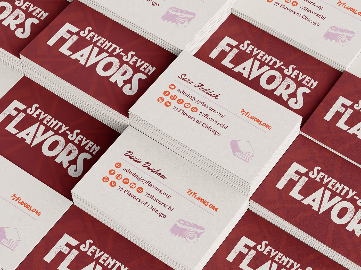
While designing business cards for Sara and Dario near the end of this project, I was able to reuse the custom social icons from their website so that all of their social accounts fit comfortably in a small space.

I also created a bonus “URL” variation of the primary logo to help the web address stand out here.

A variation of the primary logo that reads "77Flavors.org".
More Projects
Anabel for Congress: brand identity, web design and development. Bold and authentic campaign for IL-07. Image shows a mockup of the Brand Guidelines as a booklet held by a hand with brightly painted fingernails.
Golden Sunrise Mind & Body: Holistic wellness services & community. Brand Strategy, Brand Identity, Web Design, Squarespace Development. Mockup shows the Golden Sunrise landing page on a MacBook that sits on sun-dappled stone stairs.

Let’s get in touch.

Just click the button below and tell me about your design problems, goals, and wildest dreams. Even if you don’t hire me, you’ll meet a good listener with a curious mind and a unique perspective.

Drop me a quick line and I’ll reply within one business day.

Imagine what your team can accomplish when I join it. If you give me a chance, I could be your best hire ever.

All you need to do is reach out.

... Oh, you’re still here! You’re a rare one, truly; I’d love to meet you. Why don’t you click this button?

Grainy photo of a 20th century typewriter. On hover, it shifts from black and white to color. The body is a vintage teal green and the delete key is the crimson brand color.
Hire Me