Project Title

2026 Q2

Beth Somers

Brand & website for a talented food stylist
See it in the wild

Power team! Cass and Sierra’s branding ideas were so unique, and I would never have come up with them on my own. These two really nailed it.”

— Beth Somers,
Food Stylist
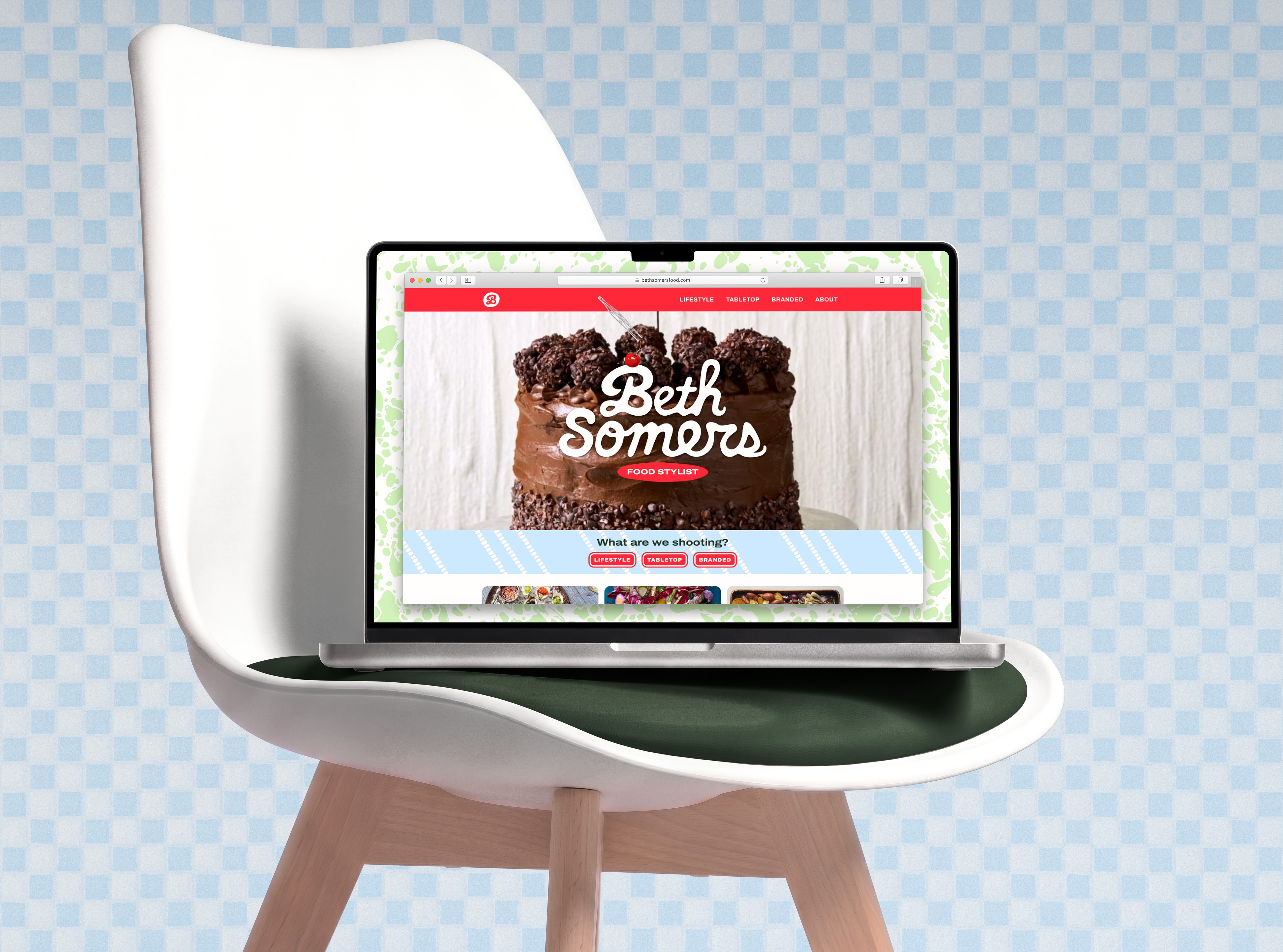
Mockup of the bethsomersfood.com landing page displayed in a Safari browser on a Macbook that rests on an Eames dining chair in front of a checkered tile wall. The desktop background is a mint-on-white enameled cookware pattern. The landing page hero section reads "Beth Somers: Food Stylist." Behind the text, we see one frame of a stop-motion video of a three-tiered chocolate cake being drizzled with chocolate sauce. Below this, a heading reads "What are we shooting?" followed by buttons labeled Lifestyle, Tabletop, and Branded.

The Brief

Beth Somers is a food stylist based in Chicago who loves creative problem-solving on the fly. Her background is in baking, and she also doubles as a 
hand model for some shoots.

When Beth reached out, her portfolio site was simple and didn’t clearly differentiate her from her competitors. She asked me and Cass to design a much more expressive personal brand and portfolio site that would showcase her personality and attract more of the projects she loves.

Screenshot of Beth Somers' portfolio home page before the redesign shows a gallery of images with a very simple design that doesn't provide a strong impression of the person behind the work.

The goals for this project were to:

  • Craft a personal brand with personality that helps Beth stand out amid the competition.
  • Build a portfolio site that showcases her work and ensure it has better SEO.
  • Streamline Beth’s communications with her potential clients by designing a branded digital rate card that she can share as a PDF.

Moodboards

We chose to design the brand around Beth’s conviction that silliness and precision can and should
exist at the same time. From there, two moodboards allowed us to explore different design directions for the brand.

Baked & Roasted

This rich & vibrant direction feels both grounded and modern while it emphasizes the brand’s high quality and creativity.

Barked & Roasted moodboard

A quirky & casual slab serif display font paired with a quietly offbeat grotesque body font feels modern as well as fun & friendly. Tart, jammy red with plum and rich eggplant feels bold & unexpected, while olive green, warm chantilly white, and bright silver feel fresh & precise but not cold. The block print illustration style brings to mind potato prints or linocut art and feels both relaxed & creative.

Playful Picnic

This fresh & airy design direction highlights the fun side of the brand and communicates both flexibility and precision.
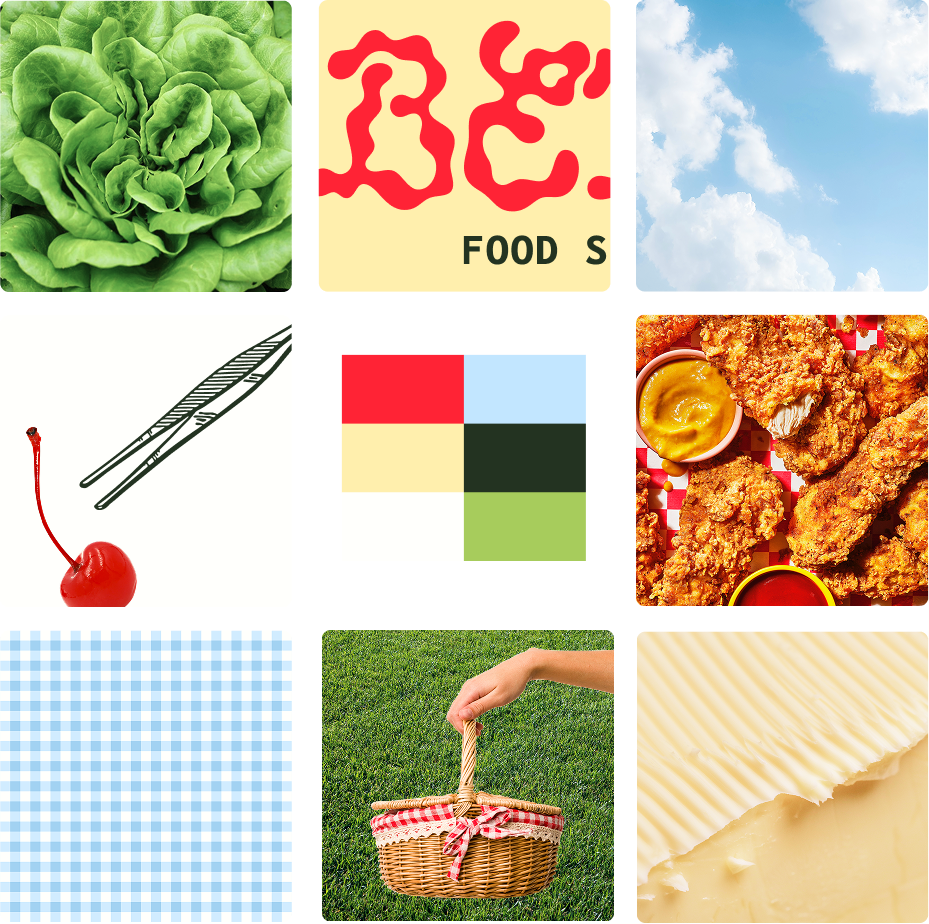
Playful Picnic moodboard

An expressive, sauce-inspired wordmark paired with a monospace grotesque accent font is physical, playful & technical. Maraschino red and clear, bright pastels are playful, while deep kale green and milky white add functional contrast that feels warm, not cold or stark. The eclectic, collage-inspired illustration style uses juxtaposition to make the brand feel both fresh & fun.

A Tough Choice!

Beth loved both options and said she was “blown away” by the brand strategy presentation.

She ultimately chose the Playful Picnic moodboard to guide our design direction because its light & airy colors suit her personality better, but she noted that gingham felt too country and asked us to explore some different pattern options.
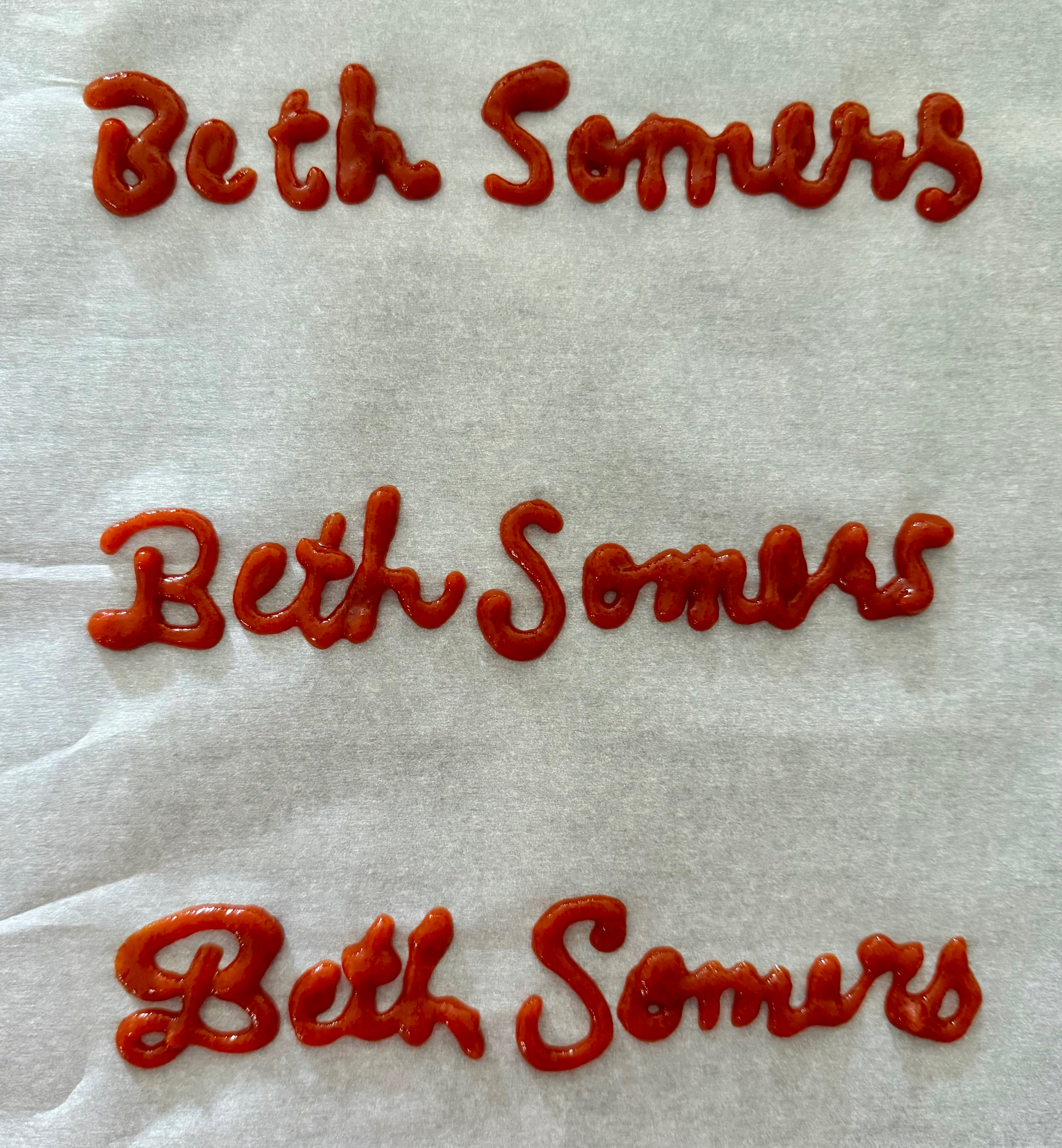
Three iterations of the Beth Somers logo handwritten with sriracha sauce on a sheet of parchment paper. The third iteration here served as the basis for the final saucy script logo.

Crafting a Saucy Logo Suite

We raided our kitchens for calligraphy-friendly condiments and then started iterating. Ketchup has too wide a nozzle and hoisin is too thick, but sriracha is just right for lettering.

Starting point in hand, I cleaned the wordmark up in Illustrator using the extreme points method.

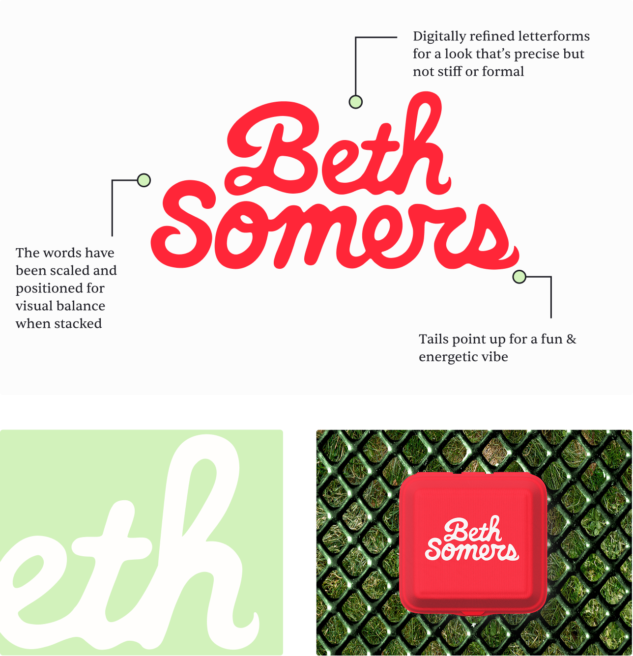
The result: expressively handwritten script that brings to mind both beautifully frosted cakes and drizzled sauces like ketchup. The letterforms’ flowing quality suggests Beth’s adaptability, while the rounded forms and low stroke weight contrast feel friendly & playful.

Horizontal Logo

The horizontal logo alongside a mockup that shows it printed on the handle of a small paintbrush. The logo has three annotations. On the capital B, "Bold swash adds visual interest and playful personality." The second annotation reads "High x-height makes this script highly legible, while rounded forms feel bubbly & friendly." The third reads "Physically handwritten with condiment sauces for a flowing & tactile quality."

Stacked Logo

The stacked logo alongside a mockup that shows it printed on the lid of a takeout box that rests on a green mesh picnic table. The logo has three annotations. The first reads "The words have been scaled and positioned for visual balance when stacked." The second annotation reads "Digitally refined letterforms for a look that’s precise but not stiff or formal." The third points to the tail of the lowercase s and reads "Tails point up for a fun & energetic vibe."

Mini Mark

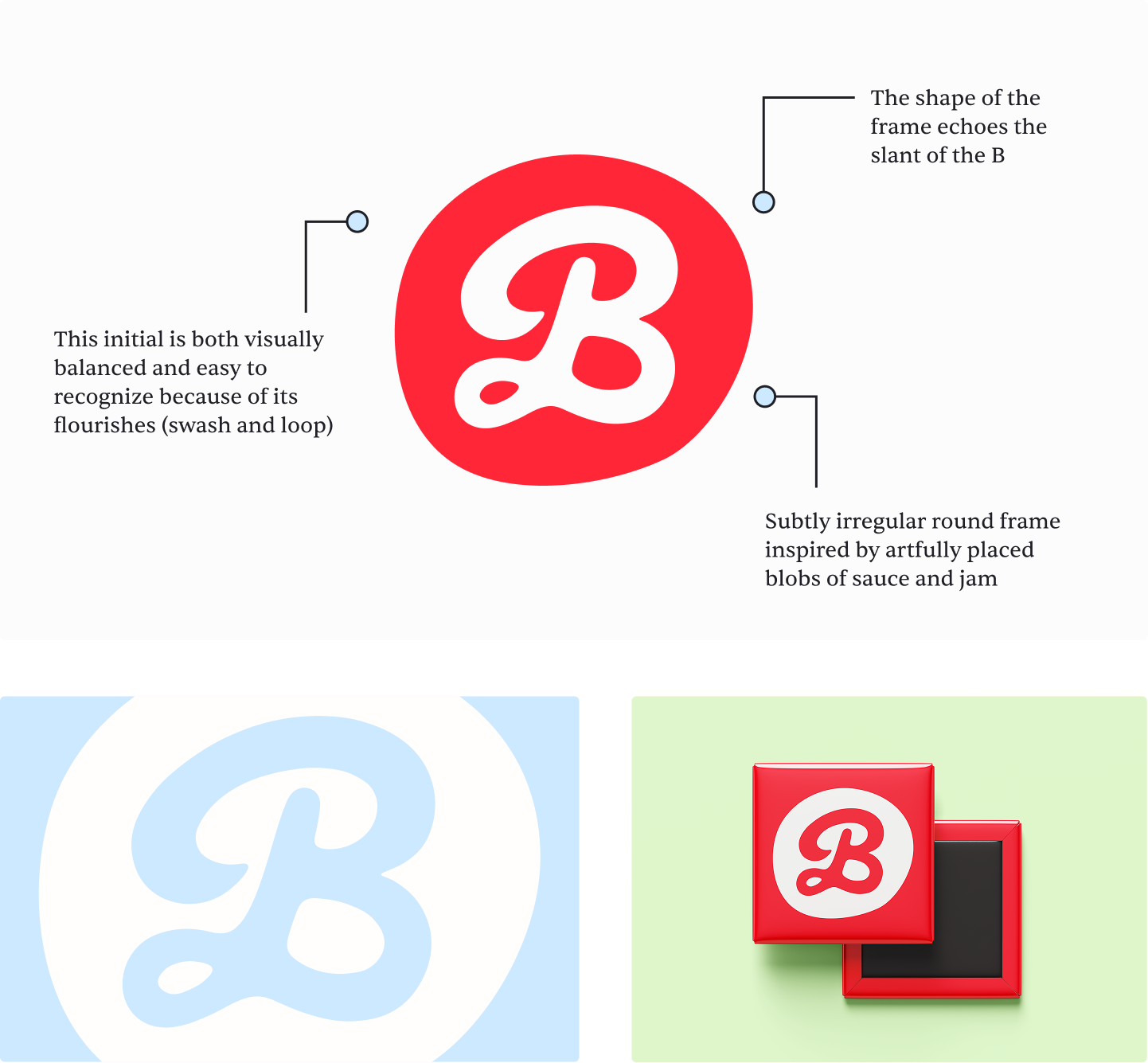
The mini mark alongside a mockup that shows it printed on a square fridge magnet. The logo has three annotations. The first reads "This initial is both visually balanced and easy to recognize because of its flourishes (swash and loop)." The second annotation reads "The shape of the frame echoes the slant of the B." The third reads "Subtly irregular round frame inspired by artfully placed blobs of sauce and jam."

Typography

BioRhyme is a quirky slab serif that’s full of fun & casual character but doesn’t compete with the expressive logo when used for headings.

Archivo Expanded is a playfully wide grotesque sans. Its sturdy shapes make the letterforms feel reliable, which makes it perfect for subheadings and buttons.

Archivo is an underused grotesque sans that pairs easily with its expanded sibling. It’s somewhat squarish, which suggests precision, but it doesn’t feel too techie for this brand. It’s also plenty legible as body text.
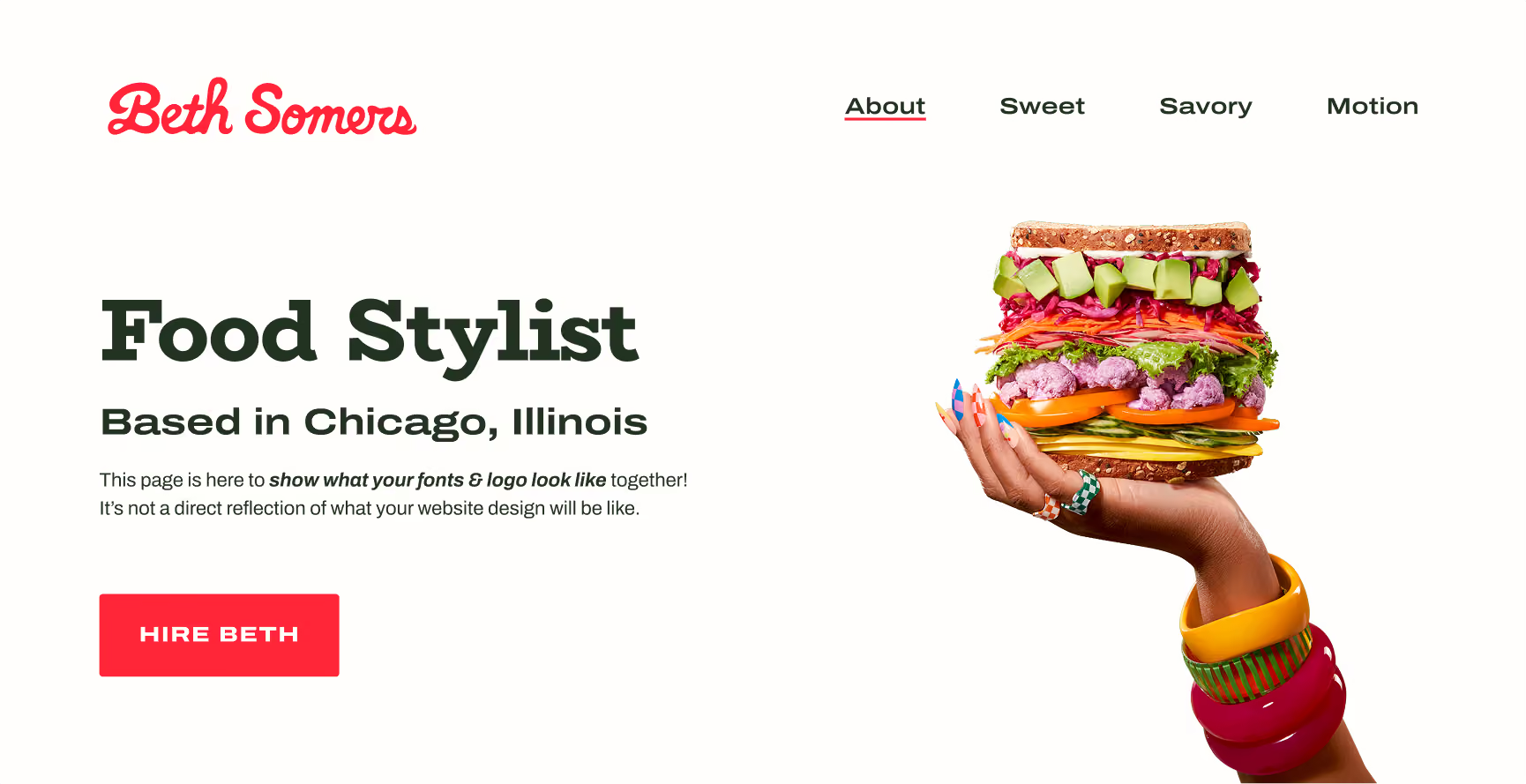
Mockup of a landing page hero section showing the brand fonts in action.
Color palette with names and descriptions. Butter:
This warm and delicious yellow shows the brand’s playful heart and ties in Beth’s baking background. Cherry: This tart red is bold, eye-catching, and subtly feminine. Sky:
Bright & airy sky blue represents adaptability. Mint: Fresh pastel green feels especially creative when juxtaposed with Cherry. Salt: A crisp, warm white allows for good text contrast on dark & saturated colors. Nori: This deep, savory green makes photos pop and allows text to be legible against light colors.

Color Palette

We chose cherry as the primary brand color because it’s bold and energetic. Clear pastels like butter, mint, and sky bring a sense of play, while nori and salt add functional contrast and balance.

Overall, the palette is vibrant but not overwhelming so the brand feels approachable, modern, and easy to navigate.

Illustrations

When we dug into what Beth actually does as a food stylist, we learned much of her work requires precise tools that go beyond those found in a standard kitchen. Beth’s kit includes lots of spoons and kitchen scissors, but also small paintbrushes, tweezers, pipettes, and rulers.

To achieve a sense of playfulness, we chose a collage-inspired illustration style that juxtaposes simple line drawings of tools with cutout photos and full-color paintings of food items.

By using the brand illustrations to depict the tools of the trade in action, we visually suggest the detailed nature of food styling.
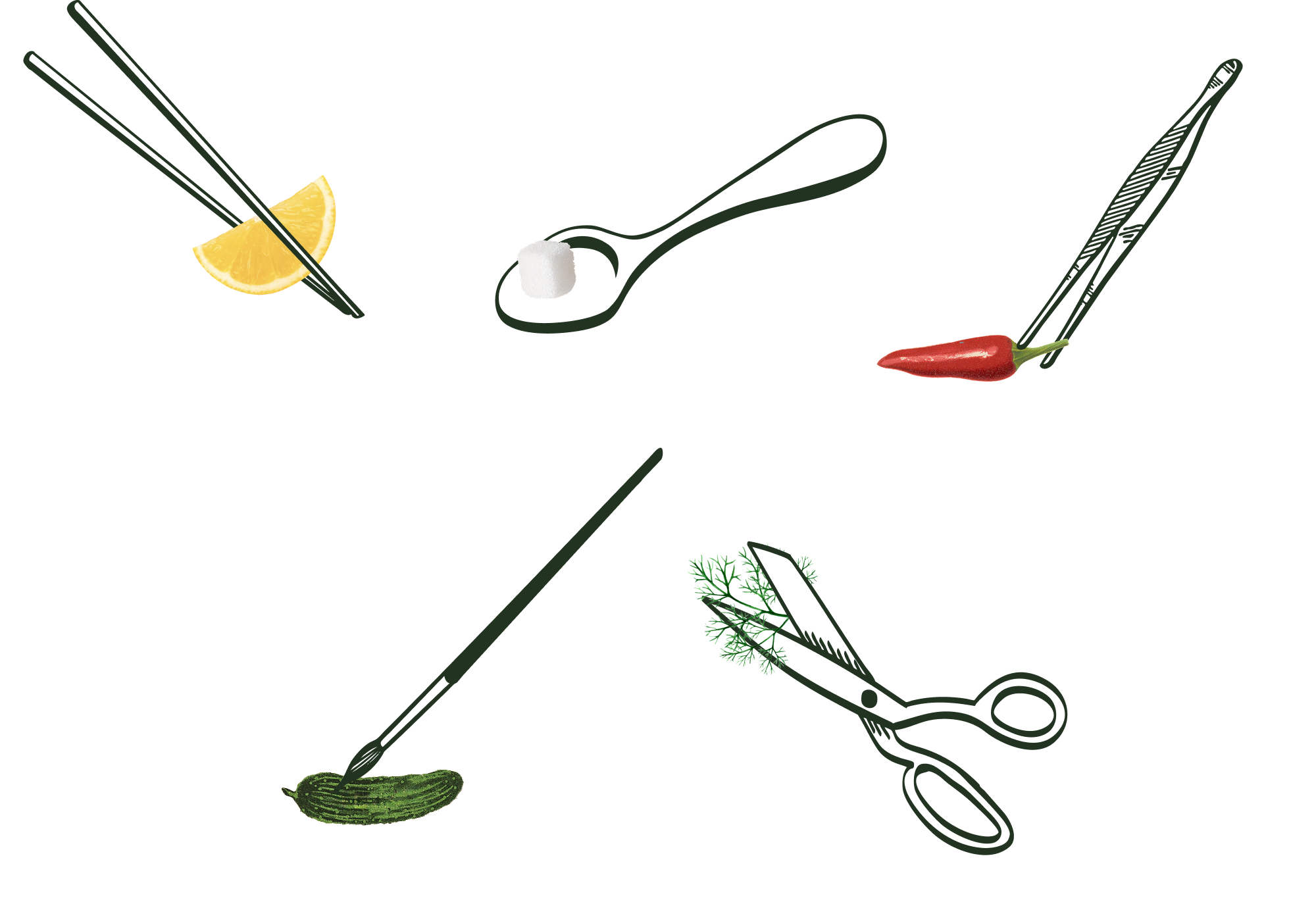
Collage-style illustrations of chopsticks holding a slice of lemon, a spoon holding a sugar cube, tweezers around the stem of a small red chili pepper, a detail paintbrush touching a small pickle, and scissors cutting a sprig of dill.
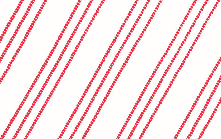
Vector pattern swatch pattern of thin red textured stripes in groups of three against a white background. Texture inspired by yarn-dyed stripe fabric with thick warp threads broken by thinner weft threads.

Pattern

The brand’s yarn-dyed stripe pattern evokes a picnic blanket or casual tablecloth, but it feels more refined than a typical gingham pattern.

Web Design

We designed the website to function as both a portfolio and a discovery tool. We focused on creating a clean structure that keeps the work at the center while making it easy for industry partners to understand what type of shoots Beth specializes in and see a wide range of her work.

Alongside the visual design, we also improved the backend structure of the site to support better discoverability. This included optimizing page structure, adding alt text to all images, and refining how content is organized so the site performs better in search without feeling overly technical. We chose to build in Framer because it suits the scale of this project and offers built-in SEO features.

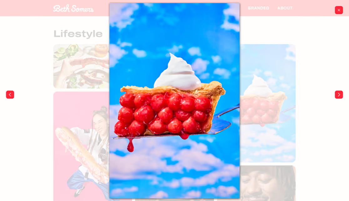
Screenshot of Beth's About page shows her headshot framed by a photo of a striped blue and white plate with scalloped edges. The heading reads "Hi, I'm Beth Somers, a freelance food stylist in Chicago who loves to travel." Icons link to Beth's LinkedIn and Instagram profiles.Screenshot of lightbox functionality on the Lifestyle gallery page shows a fullscreen view of a photo of a whipped-cream-topped slice of cherry pie against a blue sky background with clouds. Buttons show forward and backward arrows as well as an x to close the lightbox.Screenshot of the 404 error page shows a cutout photo of a dropped ice cream cone. The heading reads "404" above "Whoops! Sorry about that. Please try another page." Below this, a heading reads "What are we shooting?" above buttons for the Lifestyle, Tabletop, and Branded galleries.
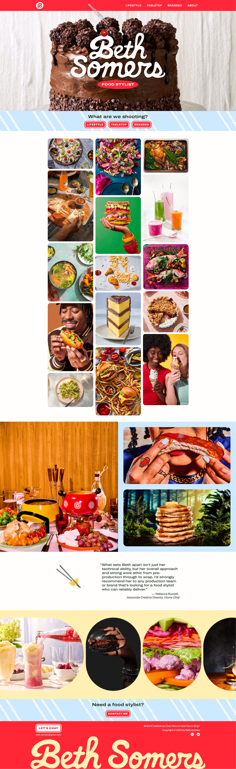
Screenshot of home page design shows multiple galleries that display Beth's work as both still and animated images as well as a testimonial section. The CTA says "Need a food stylist? Contact Me"
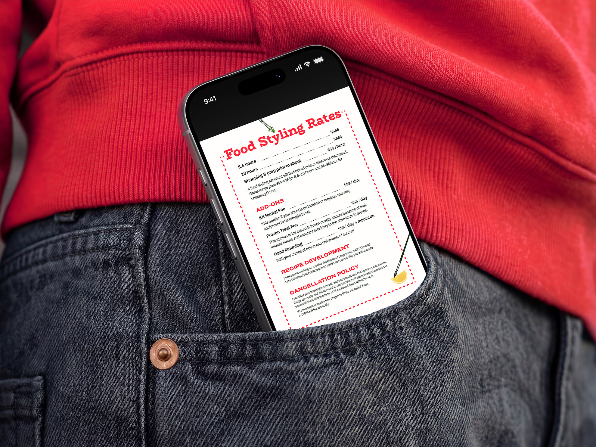
Mockup of an iPhone in a woman's jeans pocket against her red sweatshirt. The screen shows a menu-style PDF titled "Food Styling Rates" with a cherry red dashed border. Subheadings read "Add-Ons," "Recipe Development," and "Cancellation Policy."  The page is decorated with illustrations of tweezers placing a sprig of parsley and a paintbrush touching a lemon wedge.
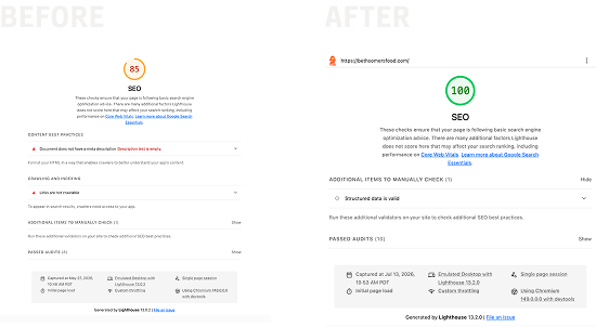
Two screenshots labeled "Before" and "After" showing Chrome Lighthouse SEO results for bethsomersfood.com. The "Before" shot shows a score of 85 displayed in orange with warning messages about SEO problems, while the "After" shows a score of 100 in green.

SEO Results

One of the primary goals for this project was to improve the SEO of Beth’s site. We found that her competitors who ranked most highly in the Google search results for “Chicago food stylist” were those whose portfolio sites used alt text consistently, so we made it our priority to ensure that every image on Beth’s site has useful and descriptive alt text.

Before the redesign, Beth’s portfolio had a Chrome Lighthouse SEO score of 85, which left plenty of room for improvement. After our rebuild, this score is now a full 100!

More Projects
Seventy-Seven Flavors. Nonprofit & podcast: Brand Identity, Web Design, Webflow Dev. Mockup shows a booklet against a corduroy fabric background; its cover reads "Brand Guidelines."
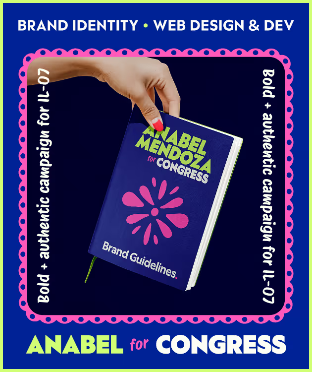
Anabel for Congress: brand identity, web design and development. Bold and authentic campaign for IL-07. Image shows a mockup of the Brand Guidelines as a booklet held by a hand with brightly painted fingernails.

Let’s get in touch.

Just click the button below and tell me about your design problems, goals, and wildest dreams. Even if you don’t hire me, you’ll meet a good listener with a curious mind and a unique perspective.
Drop me a quick line and I’ll reply within one business day.

Imagine what your team can accomplish when I join it. If you give me a chance, I could be your best hire ever.

All you need to do is reach out.

... Oh, you’re still here! You’re a rare one, truly; I’d love to meet you. Why don’t you click this button?

Grainy photo of a 20th century typewriter. On hover, it shifts from black and white to color. The body is a vintage teal green and the delete key is the crimson brand color.
Talk to Me